
“Shot with intention, shared with love”
That’s the tagline for this project. The mission statement, the motto, whatever you want to call it.
Shot with intention, shared with love…. But what’s that mean, exactly?
Well, when I created my first calendar, “Iceland 2024” I made it in hindsight. The idea of making a calendar was brought up on day 1 in Reykjavik (thanks Ann!) but it wasn’t a real, tangible project until months after the trip. I decided around November to really go for it, and sunk several weeks into organizing, narrowing down and selecting the photos. Then writing about the selections, getting them printed and sent out just before the new year. It was a monumental project for me. The trip itself, the task of going through 2000 pictures, and actually shipping out 40+ calendars around the holidays… it was as proud as anything I’d ever done; not only for how the calendar turned out, but for the distance I had to go to make it happen.
This time I would not be piecing it together afterwards. As soon as the Italy trip was on paper I started putting it in the atmosphere:
There’s no 2025 calendar, but 2026 is going to be awesome.
I said it many times, to family and friends, well over a year in advance. So that’s the first part. I was going with the intention of shooting a calendar. It wasn’t the sole reason for the trip, but it was one of them, and it changed the way I approached shooting as we traveled.
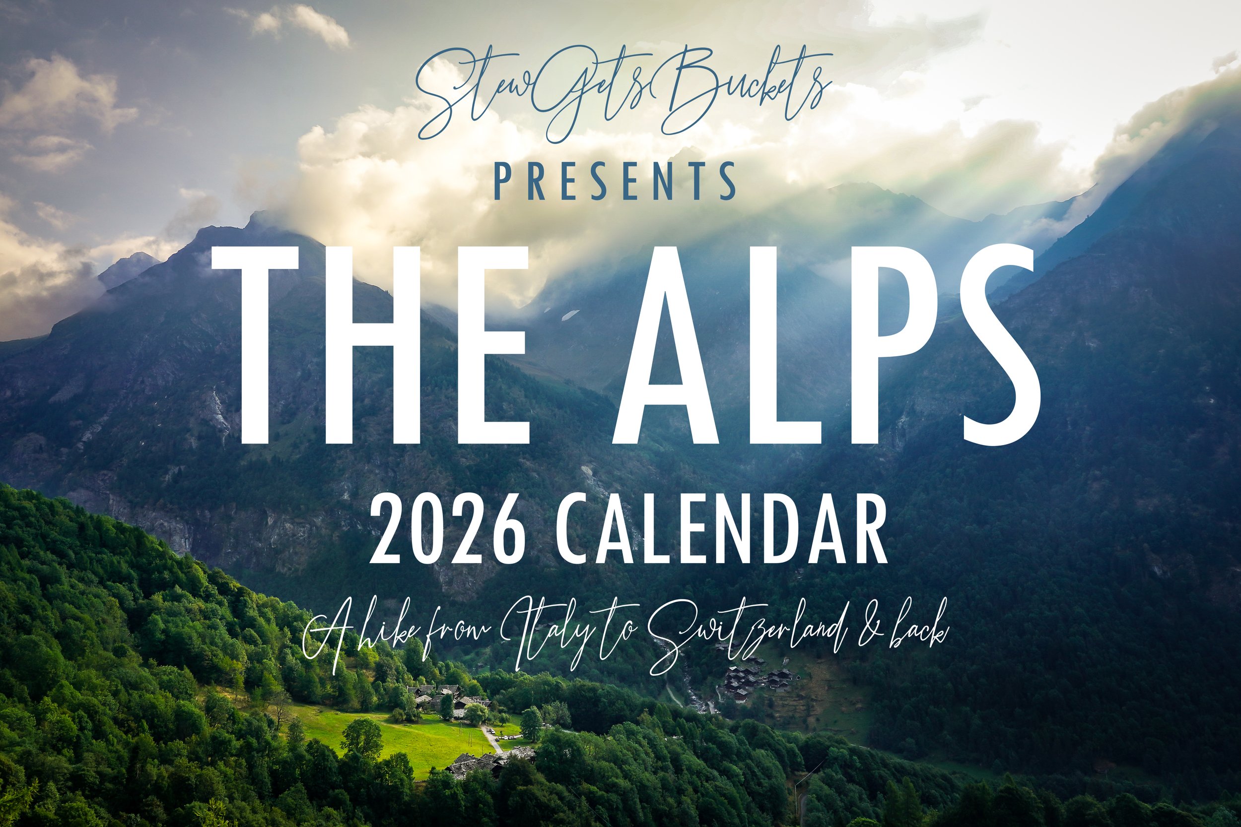
The actual reason for the trip? So I could find a photo like the one on the cover.
Seriously!
While Ann and I were traveling in Iceland we saw a similar scene; something that only looked like it was the Alps. A small farmstead at the foot of a mountain, between sprawling green fields dotted with shade from the clouds above. The flatness of the land in front of the house accentuated the jaggedness of the mountain behind it, and the size of them both gave perspective: nature felt grandiose compared to what humanity had built at it’s feet. I wanted - no - needed more of that.
“I would do like, Austria or Switzerland,” I said to my aunt on the last day of Iceland, with the goal of taking a perfect ‘Alps scene’ photo as the sole motivator in mind. We were sitting in our hotel room, not wanting to leave Europe, scrolling through options for what was next. I too now had caught the travel bug. (She had caught it the year or two prior, which is how we ended up in Iceland.)
That was in 2023.
So not only shot with intention, but it’s been a labor of love.
I was out there shooting with you in mind. Knowing it would be on your walls, something would have to see every single day. It was on my mind, before, during and after. I share it with love, because I made it with love.
Every step of every hike (and there were a lot of them) I was searching for May. Hunting for June.
Just around that corner might be July. Just over that pass, surely that’s where August lies.
It was nine days of that - from the Northern Alps of Italy, to Grachen, Switzerland and back - almost entirely on foot.
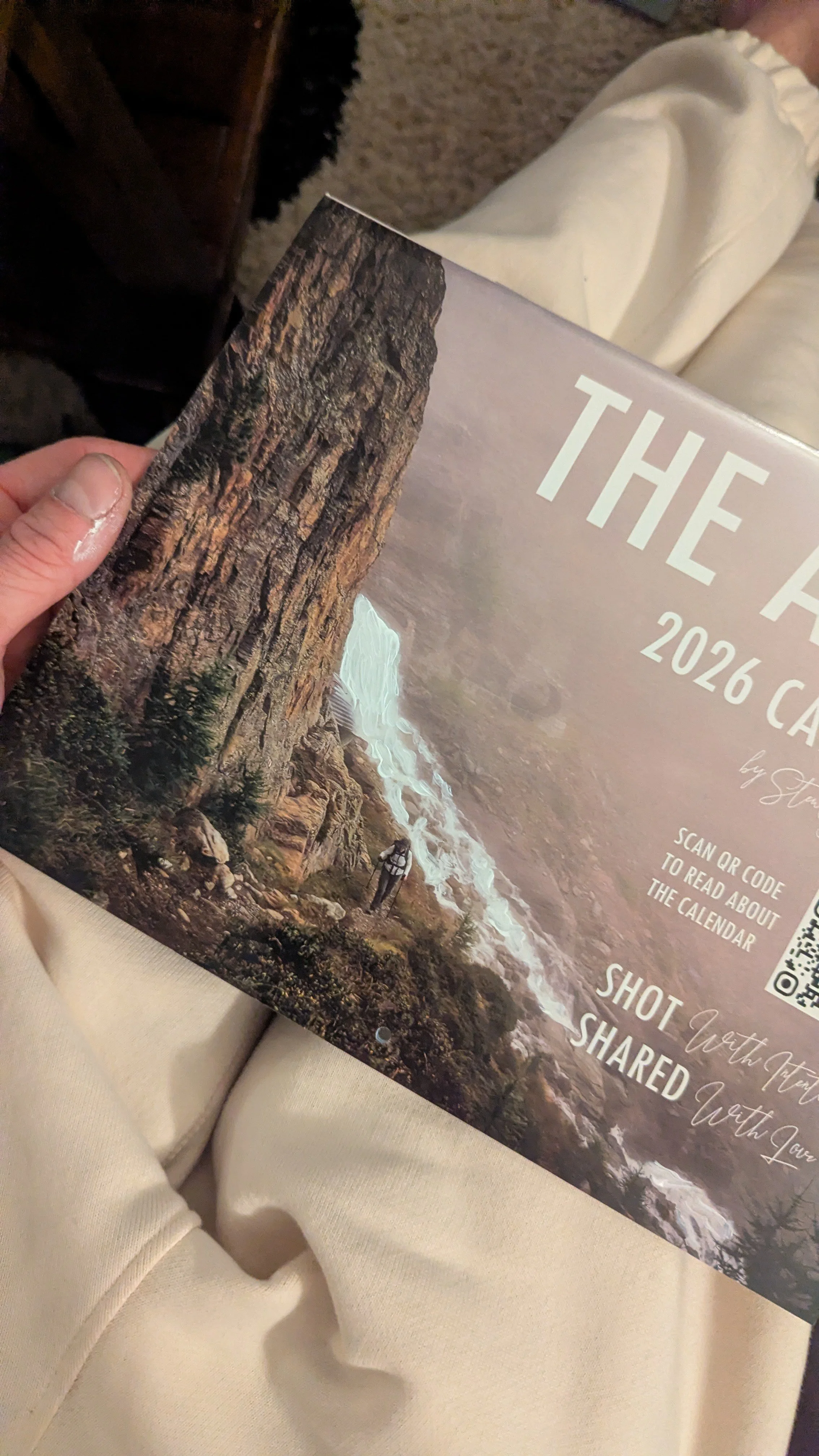
Ladies and gentleman, “THE ALPS 2026”.
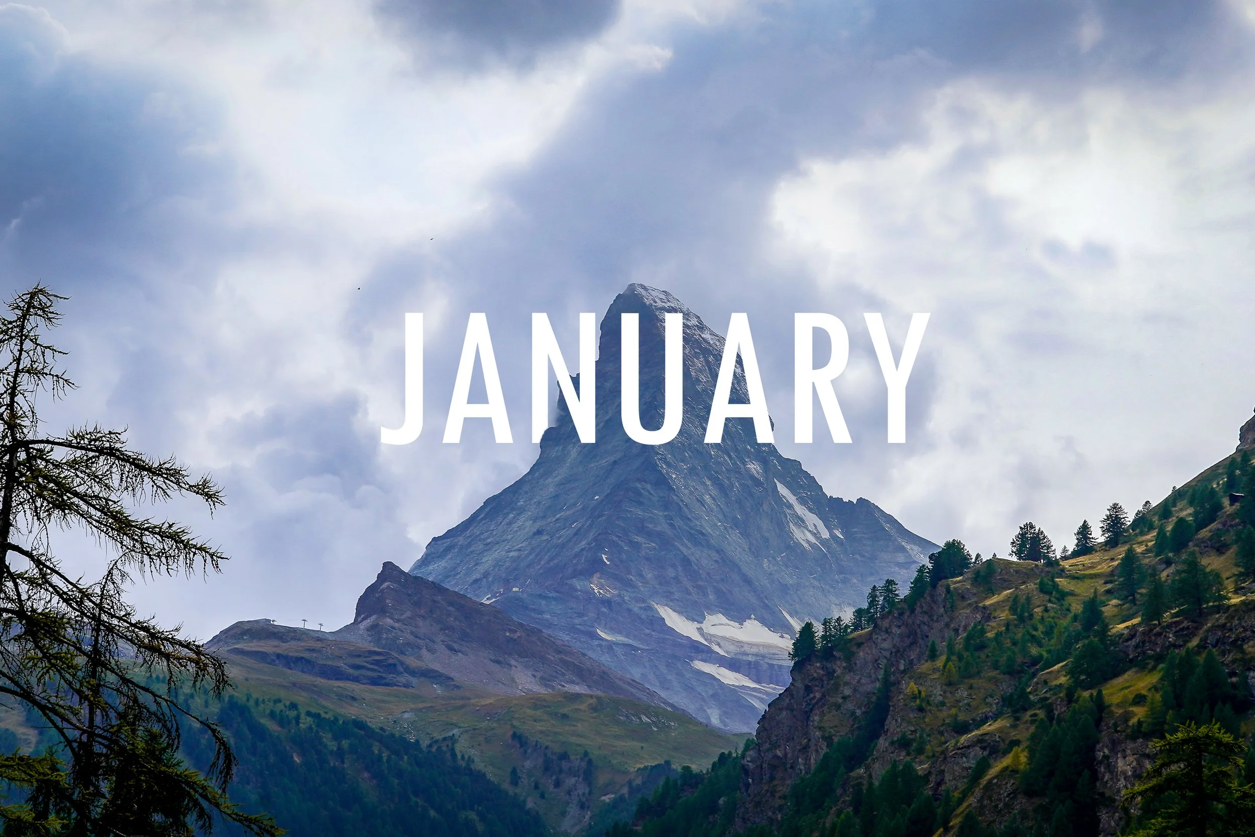
January. A new year, a new mountain to climb. Daunting, to say the least, but we’ve done it before and we will do it again.
The mountain in the photo is Matterhorn, one of the most intimidating peaks in the world. It sits just outside of Zermatt, Switzerland, where the photo was taken. Zermatt is very cool, strange and expensive town that has no full-sized vehicles and where the streets are run rampant with motor scooters and mini-cabs. It’s otherworldly, chaotic and charming, and I wrote about it here.
Alright, how about we start with some composition talk? [smattering of boos]
I ultimately ended up choosing to center the peak of the mountain in this photo for the calendar after it was taken. It was originally shot in landscape using the rule of thirds, which meant it was wider, showing more trees to the left and offsetting the peak of the mountain to the right. While I do usually keep that [one of photographs golden rules] in mind, I also often break it, and have found that for two formats - Instagram (8x10) and calendar (8.5x11) the rule just doesn’t work as well. So I centered(ish) the forbidding rock and kept it simple:
We have a big hill to climb (getting through 2026) but it can - and will - be done. Eyes on the prize, right there straight ahead.
Let’s do it.
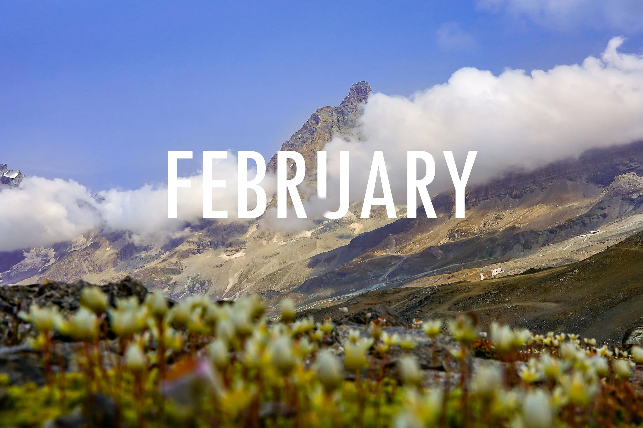
February can be a tough month for anyone. The winter has stayed it’s welcome, and we’re all ready for it to… take a hike [I’ll log off now].
Depending where you’re at, spring can be right around the corner (Myrtle) or still a month or two away (Iowa) but after a few cold months, it doesn’t matter the location, the feeling remains the same:
Let’s get this show on the road.
Similarly, this photo was taken on the tenth hour of a 12-hour hike, from Rifigio Ferraro in the northern Italian Alps, to Zermatt, Switzerland. It was the one hike of the trip that I was ready to be done with. Just like it says on the cover, literally, a hike from Italy to Switzerland and back. To be technical there were two cable car rides - I think I actually crossed the border in a cable car [Editor’s note: no passport needed!?] but I left Italy on my two feet and arrived in Switzerland on my own two feet without any vehicles. 30,000 steps, mostly through the mountains. By the time we walked through Zermatt to our hotel I was physically and emotionally exhausted, much like the tail end of of a lingering winter.
During the stretch that the picture was taken, we had gotten out of the beautiful green slopes of Italy and begun marching into this terrain - something that looked like another planet, a barren one. We were approaching Matterhorn (it sits just to the right of the peak in the photo) and the hike was getting long. I actually broke off from the group to go pee when I saw these small yellow flowers budding on the side of a hill, mostly from rocks. They were a welcome surprise. A sunny day in February.
Again, it can be a tough month.
I hope you reading this are surprised by some flowers and some sunny days this February, whether they be literal or otherwise.
Hang in there, spring is coming.
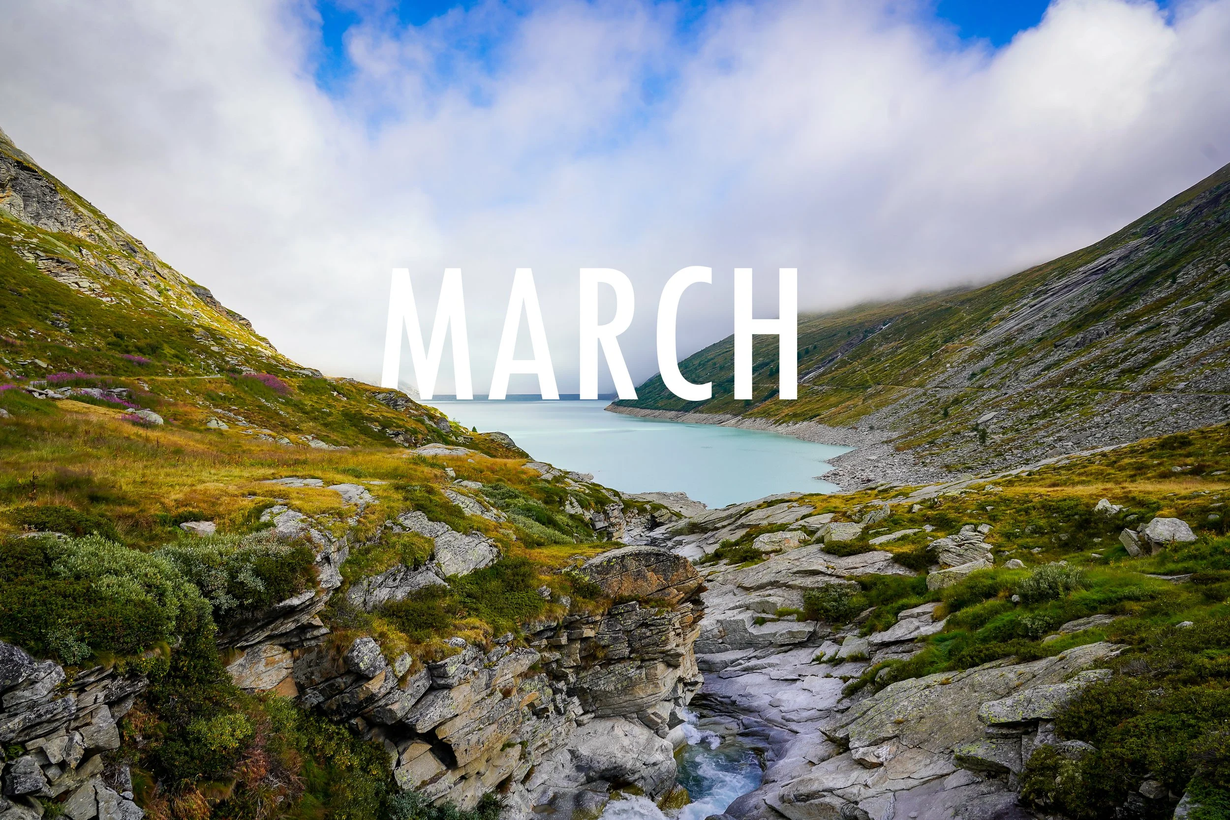
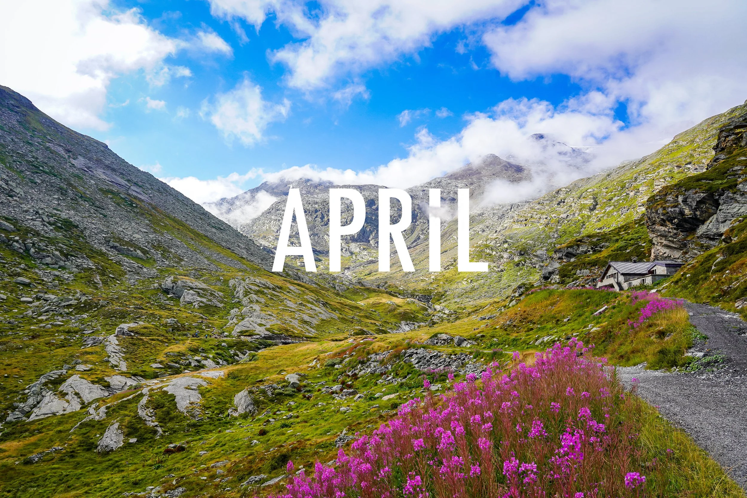
I wanted the calendar to be sequential as much as possible. So March through May is basically a three-piece series inside the calendar. My one and only hesitation with that choice is that they might be too similar - there are only twelve (13 in this case) chances and each one can make a statement. So why do a series where three are similar? Well in the March photo, there is just a tiny sprinkle of pink flowers off to the left, way in the distance. I wanted to use them as the starting point and visually ‘bring them closer’ through the April and May photos as spring and summer approach. I am ultimately happy with it but if I had to change anything about the calendar it would probably be to make one of them stand alone visually a little more - probably May.
The lake in the center is man-made and it’s matte icy blue color gives me a frigid feeling. But in the foreground you see the water rushing, and to me that evokes the feeling of thawing out. The ice melting, the earth softening.
There are signs of the beauty to come.
Fun fact: these are the SAME flowers that were off in the distance in the March photo. If you look closely, about an inch below the ‘A’ you can see the bridge where I took that shot from.
Going back to the calendar being ‘sequential’ and wanting to give the feeling that spring was getting closer, this features literally the same flowers, but closer and taking up much more composition of the photo. Part 2 of 3 in the ‘Spring Flowers’ mini-series.
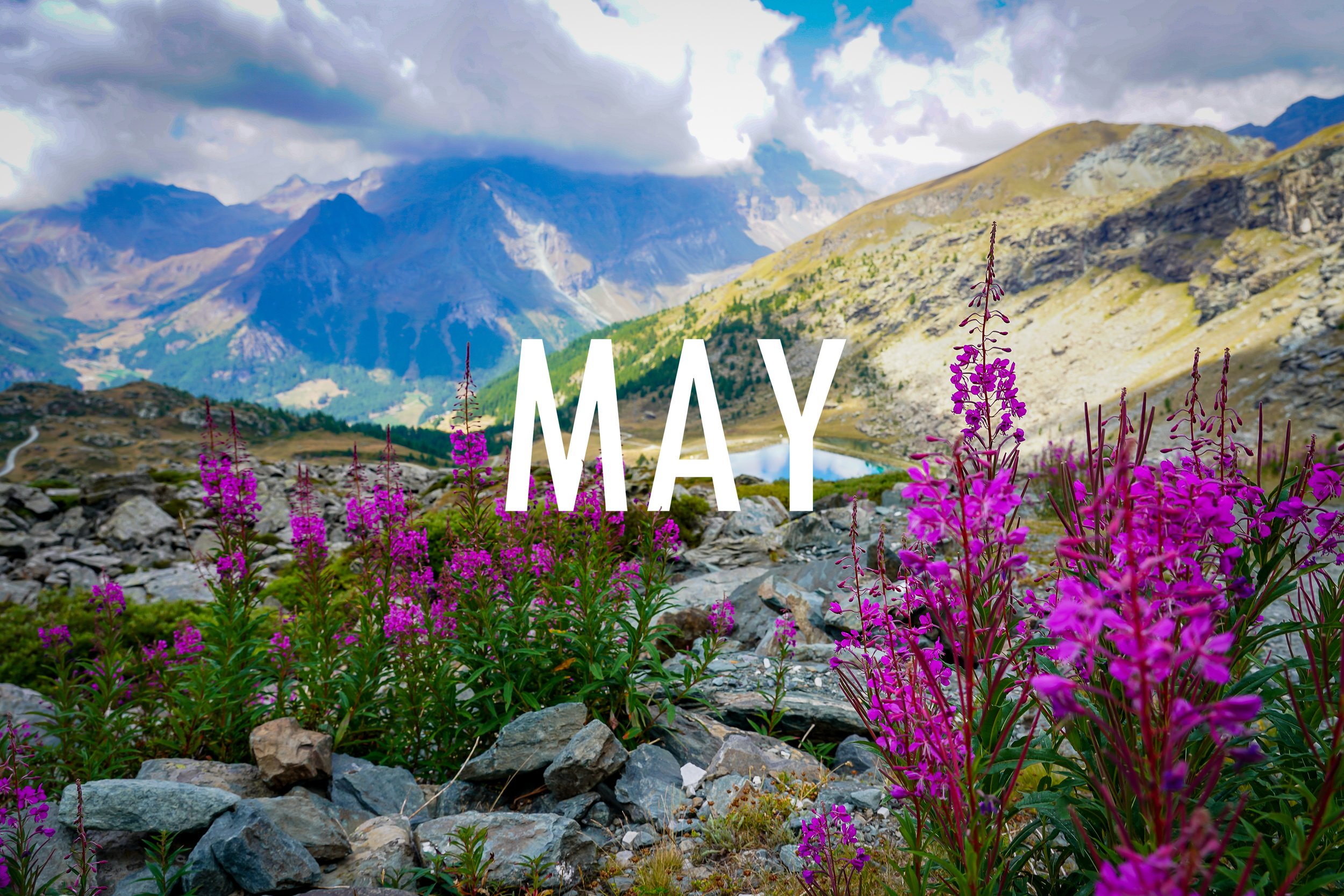
No matter where you’re at - Iowa, Myrtle, wherever - May means spring is here. So here I featured these ‘May flowers’ close-up and in your face, indicating that it’s finally arrived, the third in the series. There are only a handful of the flowers in focus (just to the right of the ‘Y’) which is actually something I chose on purpose. It’s symbolic of many past Mays in my lifetime; a visual metaphor: it’s hard to stay focused with summer around the corner.
See all the photos from this hike and read about me deciding to ‘take the high road’ here.
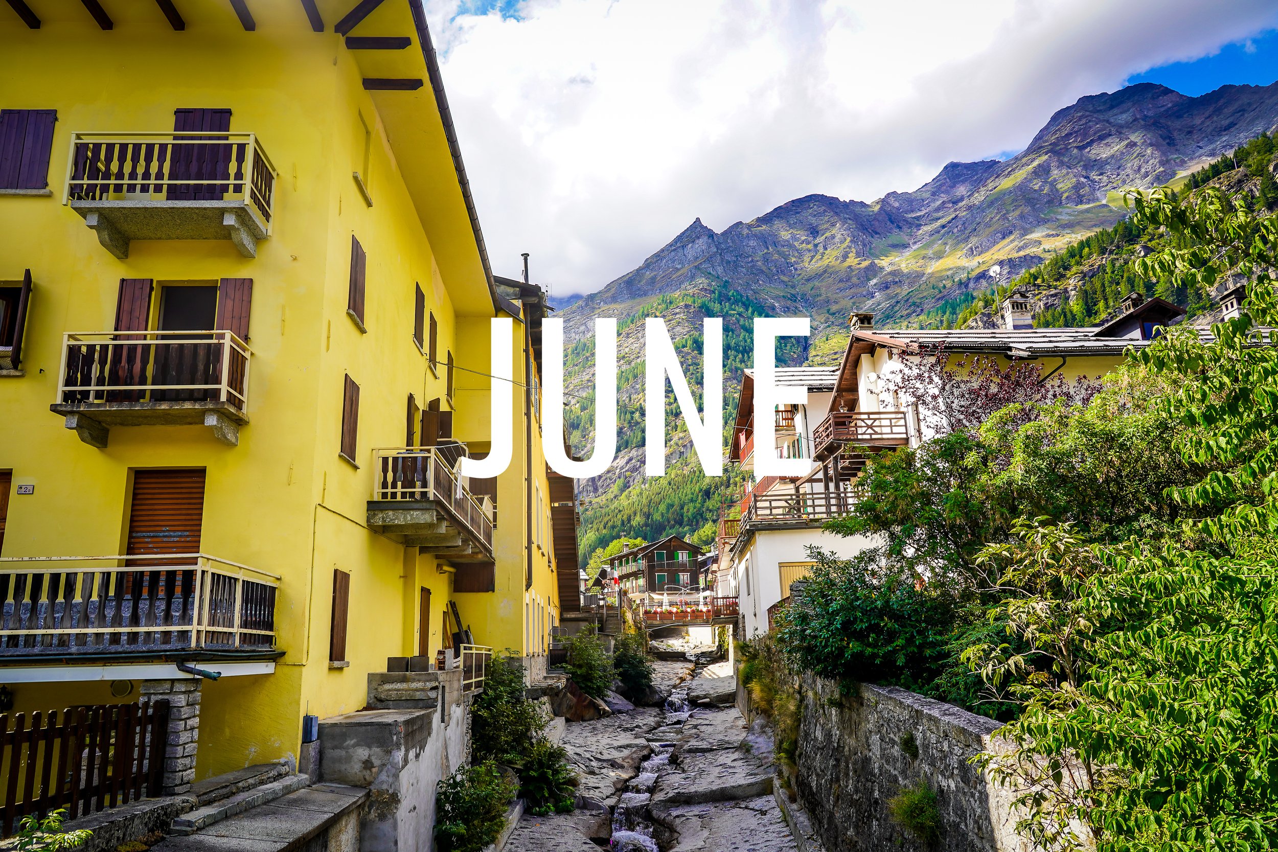
Macugnaga, Italy. One of the coolest little places I’ve ever been. A tiny town that punches well above its weight. I wrote about the spectacular church hidden away in the center of town here, and wrote about my time in this beautiful Italian hideaway here (link coming soon).
This shot is from the heart of the village, looking up a the mountain we climbed to get there, with a small stream winding through the bright, boldly painted houses. The yellow felt warm and happy to me, which is usually how I feel when summer comes around. Big summer guy.
Did I mention how cool Macugnaga was?
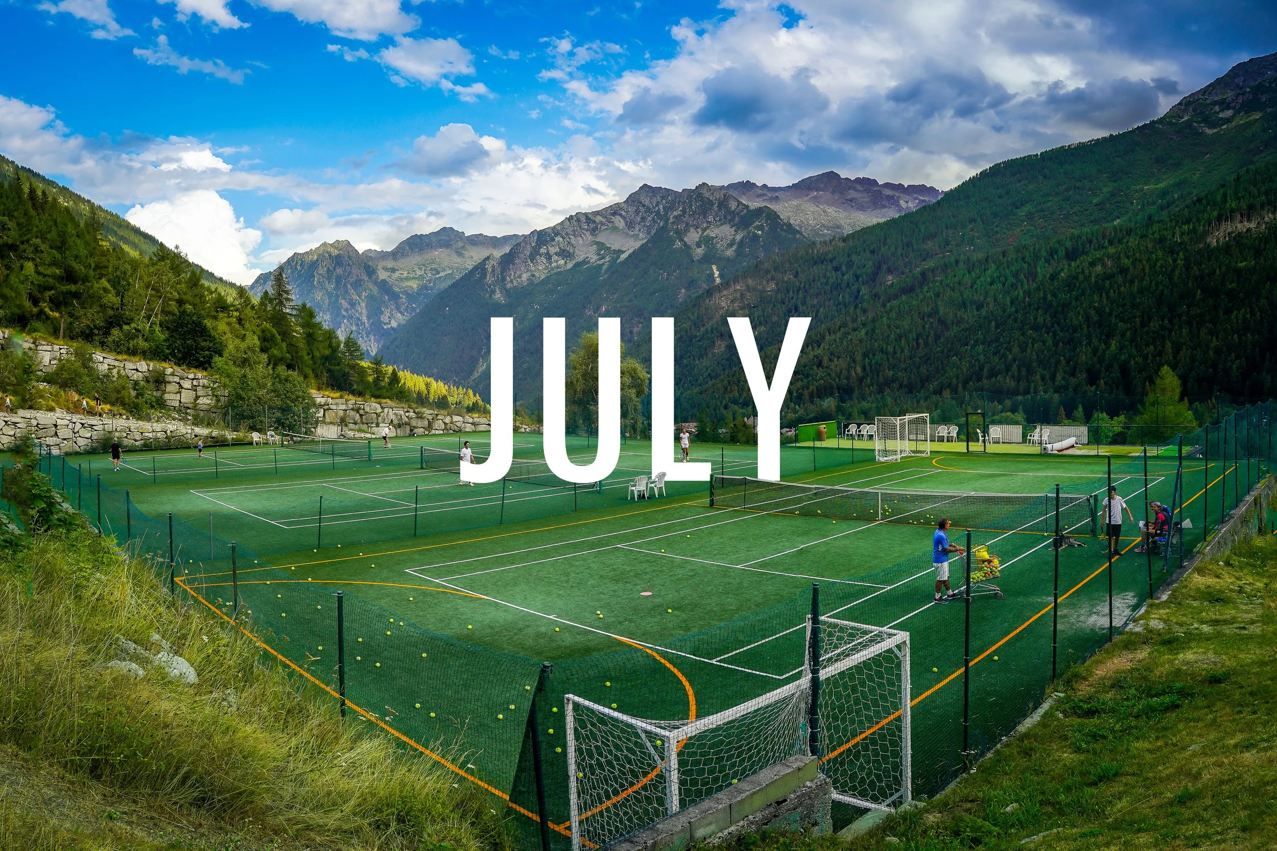
This one’s a tribute to my aunt, grandma, dad, and conversely, to anyone showing me ‘zero-love’.
You wont find a finer spot to line-fault in the entire universe.

This is another man-made lake just south of the Refugio we stayed at on night two of our hike to Switzerland. The refuge - a cabin basically - was just down the hill, maybe a twenty-minute hike. Awaiting for me there was one of the most relaxing afternoons of my life. I wrote a blog entry that will never come out, ate carrots pulled fresh from the mountain that afternoon (when in Rome) and prayed a lot. No internet, no TV, no phone. Just the warmth of the August sun, a pair of size 44(UK) community Crocs (!) and a view of a tiny town in the valley below. A deeply spiritual day.
It never occurred to me to hike back up here at night for a reflection shot of the stars until right now as I’m writing this. That would have been a spectacular photo and would have been a rare dipping-in-the-toe into the astrophotography pool for me. I had plenty of time - the entire group slept about two hours combined that night. The cabin was the stuffiest room I’d ever been in and I could have probably powered the electricity for the whole place with my tossing and turning. Unfortunately, it was rest that I desperately needed - the following day we got up at 4AM and hiked to Switzerland.
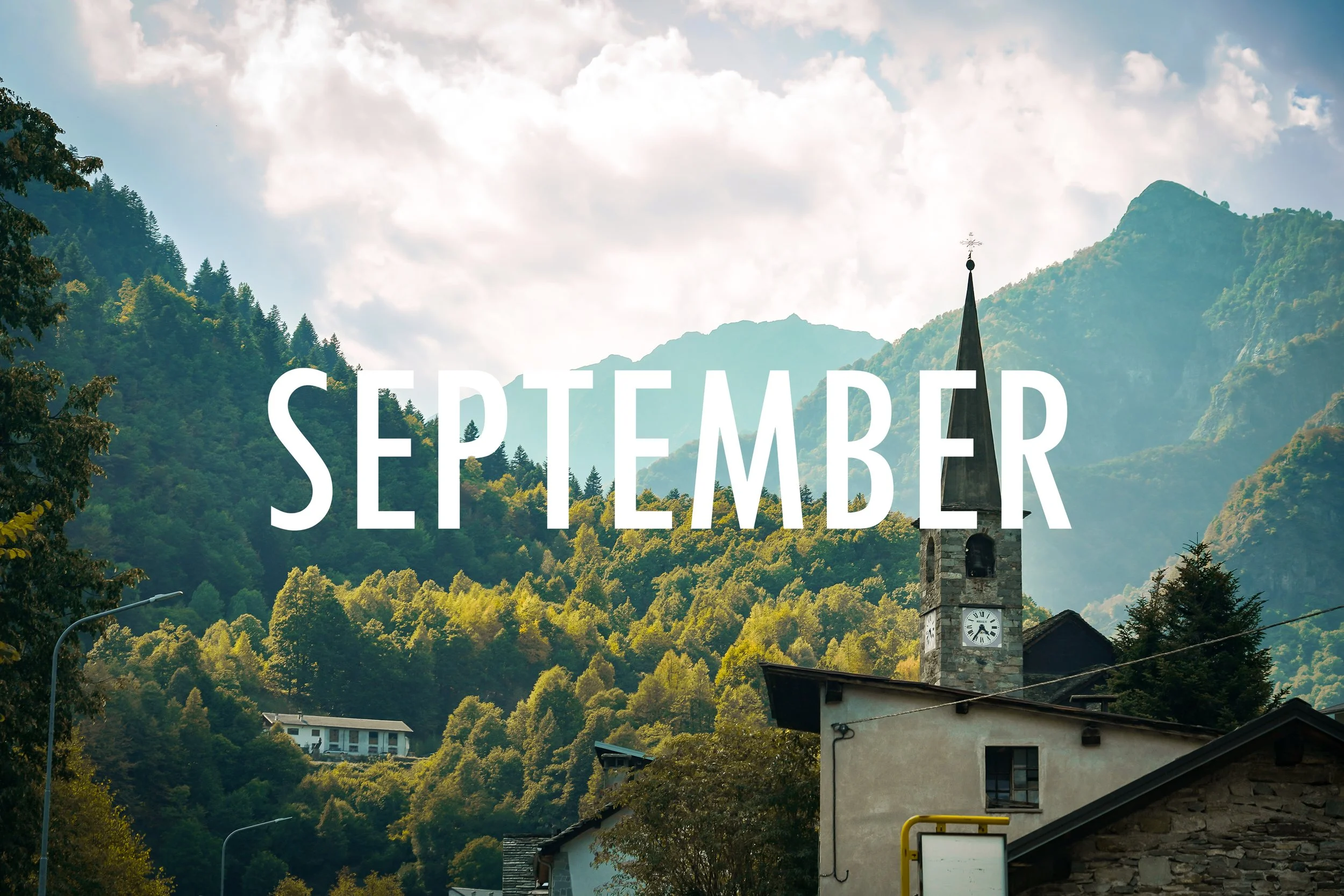
The September selection was taken through the windshield of a moving sprinter van going 88kph, at approximately 4:36 pm Central European Standard Time - if that clock is correct - winding through the valleys of northern Italy. This, simply put, is the most European picture of the calendar to me. [Editor’s note: We drove on the right side of the road in both countries. That surprised me.]
Aside from that, the photo just screams September. The colors of the trees feel like transition; from summer to fall, from freedom to school, from life to death. The cycle is everlasting, and I feel like this shot captures a very specific slice of it - one you want to hang on to, but know you have to let go of soon.
This one is a little play on words. I turn 40 in October, aka finally “Over the Hill”. I remember this being a big deal for my parents and their friends back in the day. Parties, gag gifts, the whole nine. I don’t think it carries the same weight anymore, I hardly hear it at all and I know my friends that have hit the milestone don’t feel like they’re halfway over anything.
If you’re reading this and you feel old - stop. The earth is old. Europe is old. These churches are old.
You? You just got here. You’ve got your whole life ahead of you, regardless of your age.
Go out there and live.
“40s the new 30, I’m so hot still”
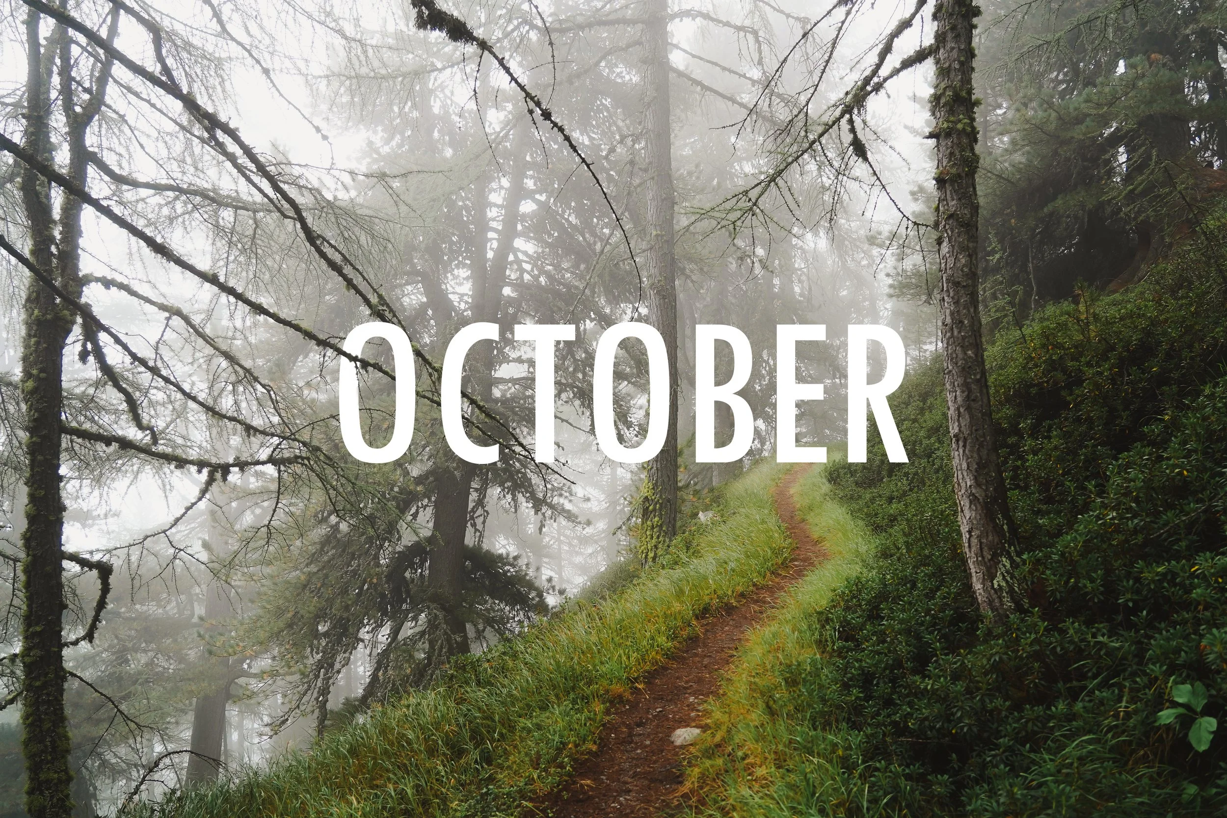
This is the only photo in the calendar where I knew right when I took it that it was making the calendar. The type of shot where you hold your follow-through in the air an extra second for emphasis. Might even start running back on D. This one’s goin in.
The warm fall colors, the mysteriousness of the fog and unmarked structure, the pines creating a subdued skyline in a cascading angle, showing the steepness - and therefore danger - of the setting. It had October written all over it, and that’s where it was going until it came time to actually put the calendar together.
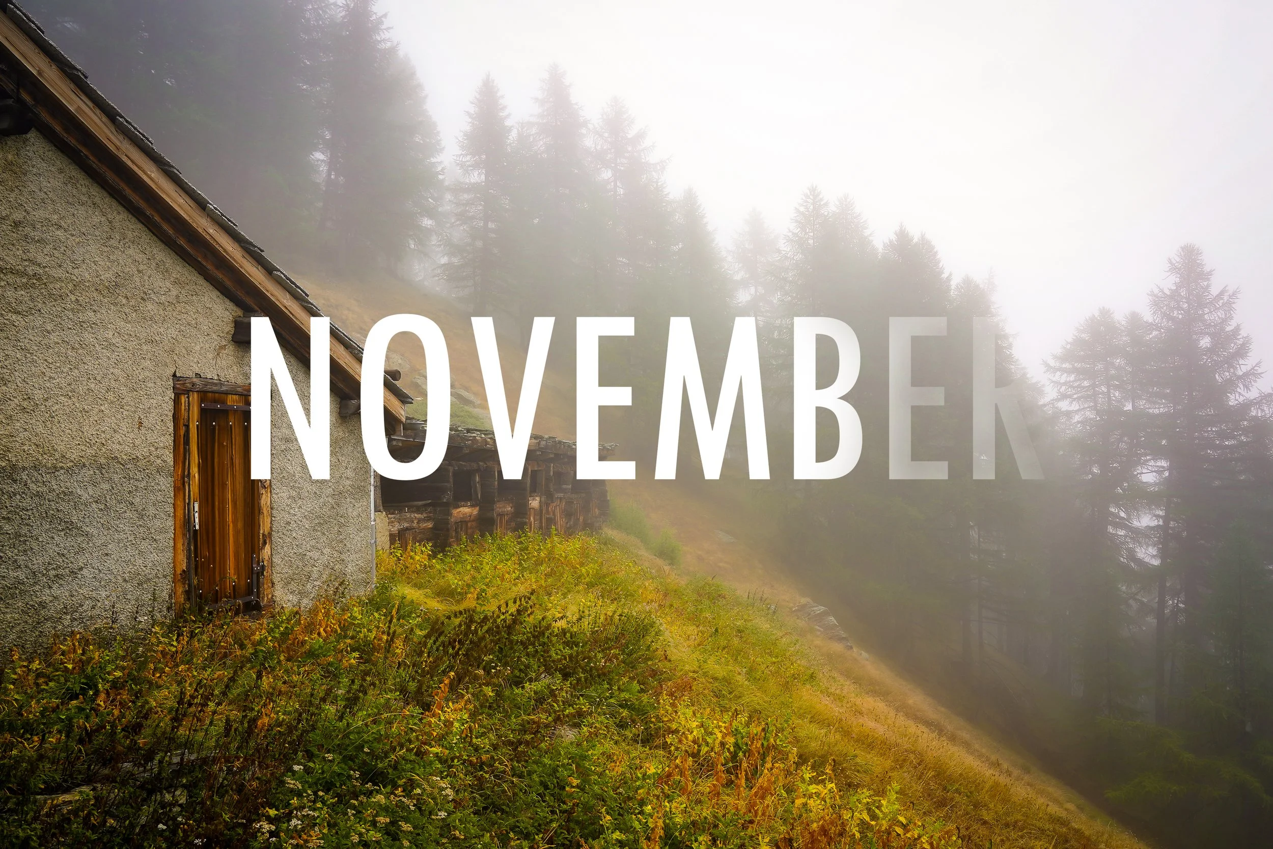
I didn’t have a better November shot, and the ‘Over the Hill’ pun was good enough for me. It still went in and that’s what matters.
This is Randa, Switzerland. I hiked through it twice, which took about ten minutes altogether. It is not a big place. It is however, at the base of a big mountain, one that hosts the Europaweg Skywalk, which is what brought me there. Read more about that man-made horror here.
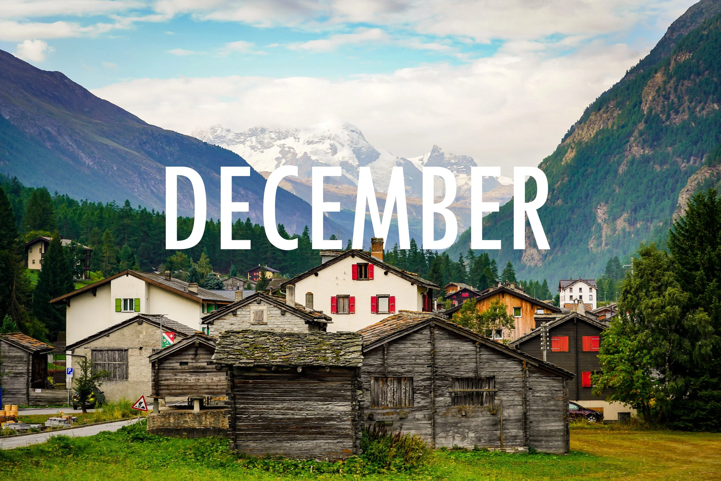
The December selection is a spiritual sequel to my 2024 Iceland December photo, which featured the just-as-tiny-as-Randa town of Vik. I joked then that the choice was simple - it looked like a place where Santa and his elves stayed ‘in the off-season’. With a population estimated at 300-600, depending on the time of year, that sounded to me like about the number of elves necessary to keep production running smoothly. A light-hearted joke to end the calendar blog where I wrote about some not-so-light hearted stuff.
Randa had the same feel to me, so I made it the spiritual successor to Vik. Randa, however had it a little more precise: 435. Four-hundred and thirty-five residents, all year long. So while it’s not likely going to upset Vik as the lead suspect for off-season elf housing, it was a very similar size and shape, and therefore my selection as the sequel. Quaint, old, charming. Pretty delightful.
Fun tidbit: the flag in the photo is actually red and green, however none of the shudders were - I changed them with a quick edit to give it a little more Christmas spirit. That is the only alteration I made on any photo in the calendar.
About the calendar itself:
I used a new manufacturer this year, one that offered more flexibility for finishes and designs. I chose the font for the Months and Days (the ‘dates’ font was unfortunately not an option - I don’t love it, but it is what it is) as well as the colors for the margins. For most months I tried to match the margin to the color scheme of the photo, with February as an exception; I did pink for my niece’s birthday.
The outside covers are printed in a high-gloss, which look amazing but do not have the same texture to handwrite numbers and messages on.
So I went a different route this year.
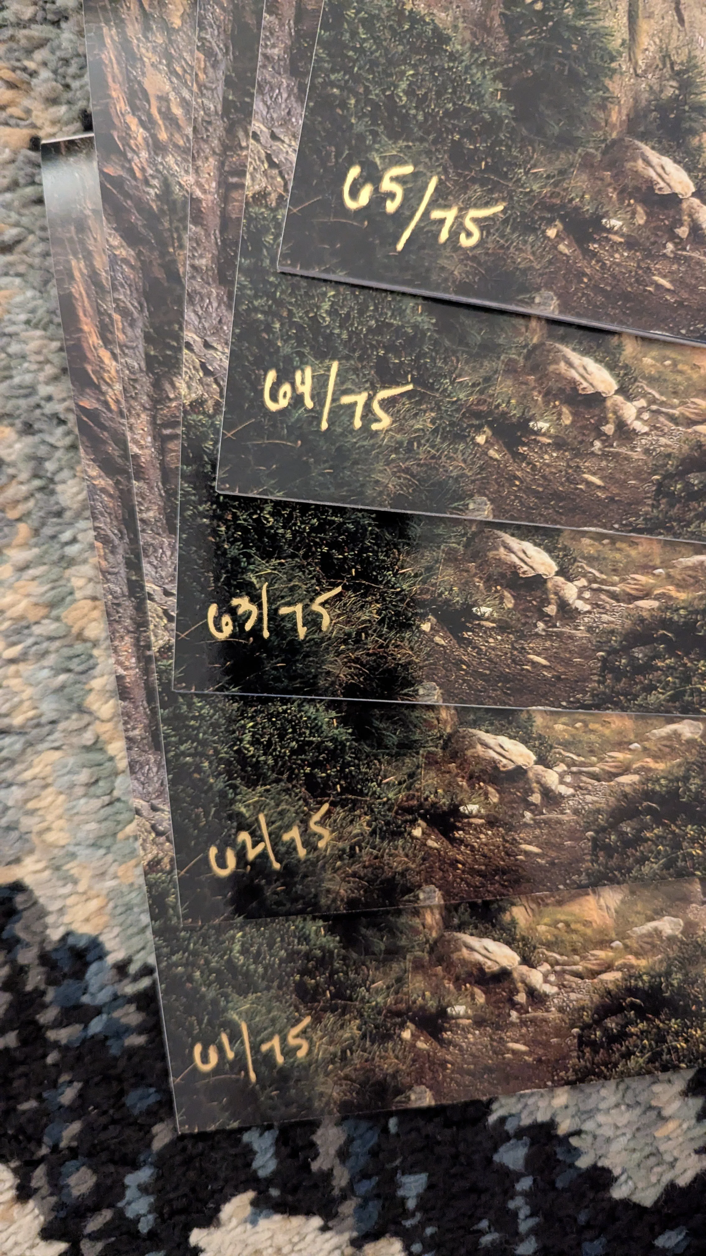
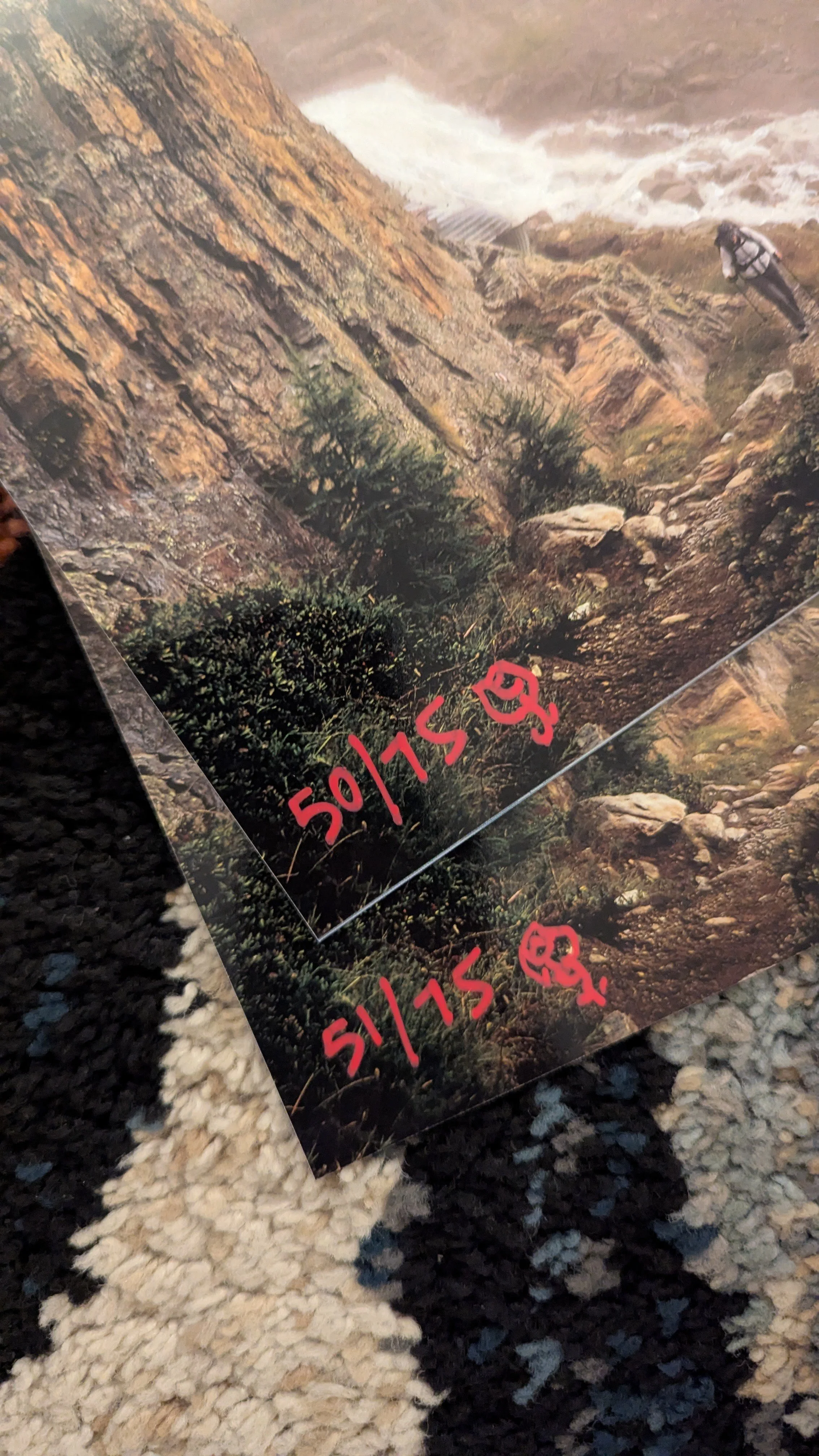
Each calendar has a hand-painted waterfall on the back. All seventy-five.
That’s right, I wanted EACH piece to be a unique piece of art - so they are! In the craziest heat-check of my life I decided after doing * ONE * that I could do it again successfully 74 more times. Then I did.
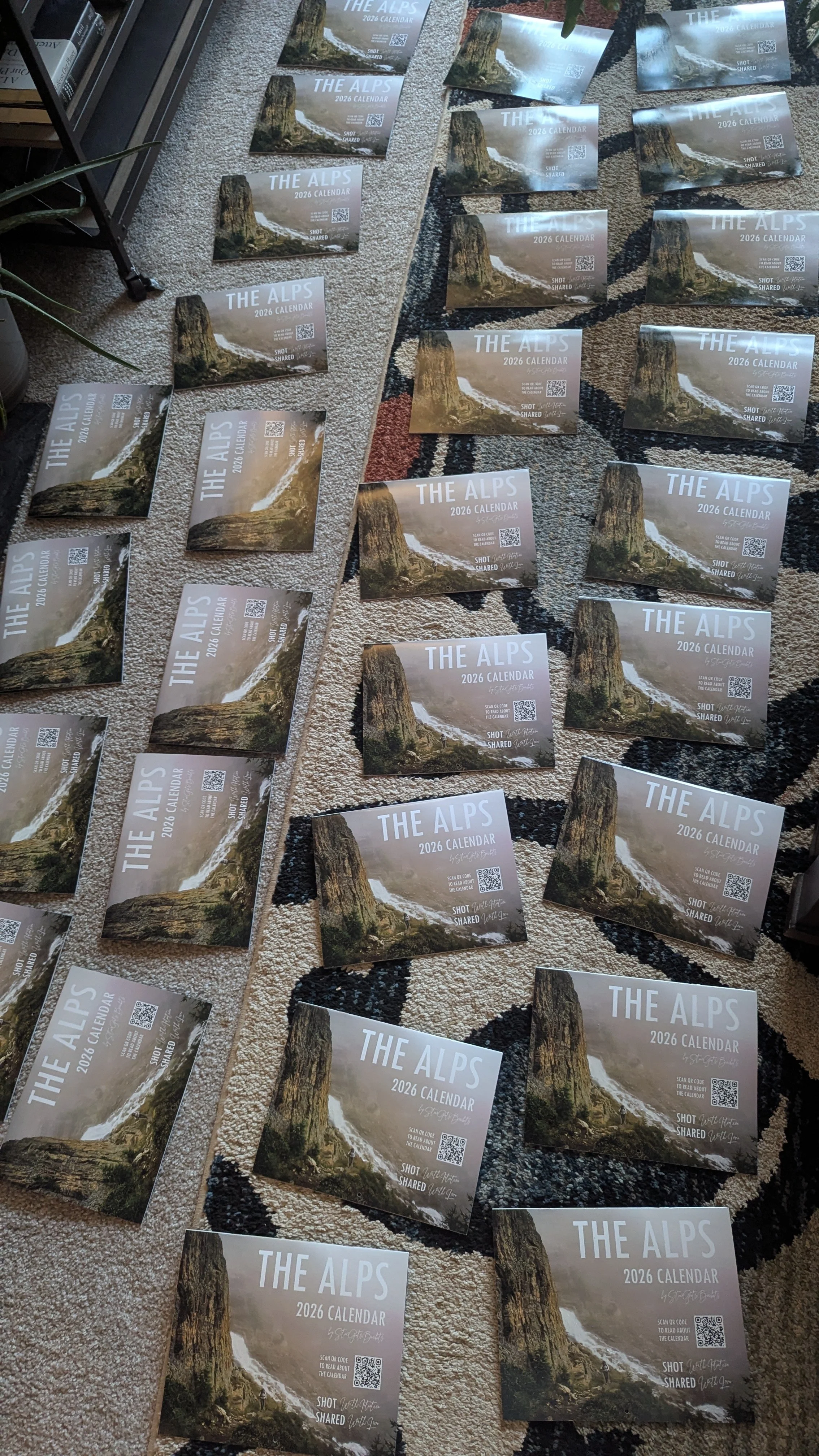
Are they all perfect!? Hell no! I can’t even paint! It’s not in TOP TWENTY of things I’m good at. But I did it with my heart. On most of them they’re fairly indiscreet, you kind of have to be looking for it to even notice. But the gist of it remains. These are each hand-painted, unique works of art.
And, I numbered them! Each copy is numbered in paint /75. Once again, similar to the 2024 calendar, I did some ‘rare inserts’ and 1/1s, another a tip of the cap to ‘The Hobby’.
First /4 are numbered and addressed to the recipients in big silver marker. Immediate fam only.
/5 through /49 are all numbered in white paint pen, with ONE exception (/40). They have no personal inscriptions or notes in them, making them tradeable pieces of art. Want your lucky number 20? You’re going to have to barter with Sue and Daryl. Want to swap with Hay Hay because your waterfall kinda sucks? Better make her a good offer!
Now do I think actually think anyone will do this? Of course not, but it’s the concept, the idea that you can, that makes fun and unique to this year. All of those copies went out to friends and fam of mine - but they don’t all know each other - and it’s fun to think about a crossover episode potentially happening because of the calendar. Again, I don’t think anyone will trade or collect them, but the fact that you can it’s part of what makes this art project unique.
/50 and /51 are numbered in red with a hand-painted rose next to it, for Rim and AB, the Rosecast homies. I wrote about them here.
/52 has a golden palm tree and is going on the wall at my job, the ‘52’ being a nod to the hard work we put in there (although I took two weeks off this year to shoot this calendar!) Also I marked in there that I’ll be late on Friday.
/53 through /59 are also numbered white paint pen and tradeable.
/60 through /65 are numbered in GOLD and will hopefully be given away on Instagram next week (for charity, details HERE - it will be interesting to see if I have anymore clout on that app haha). [Editor’s note: three given away, two remain]
/70 is numbered in green and has found a home other than it’s original intended destination. It’s better off where it ended up. Life is like that sometimes.
A few of the 70’s I used to reach out to people who I had lost touch with, for a few years at least. They still mean a lot to me, these ‘calendars’ seem to fly by the older we get. Shout out to them.
/75 is numbered and addressed to “THE SUNG” in ORANGE. For Use at NEED PIZZA only.
I didn’t write messages or birthdays (with a few exceptions) leaving the inside of this year’s edition much less ‘marked-up’ than the 2024 edition. As I stated, the sharpie on fine-art esthetic was tremendously inspired by (stolen from) Virgil, and I will keep that unique to that edition.
Oh, also, I stuck a hundred bucks in one of them with a note stipulating that they had to go eat at Need and leave my friends a good tip. That’s called a ‘win-win-win’. Merry Christmas!!
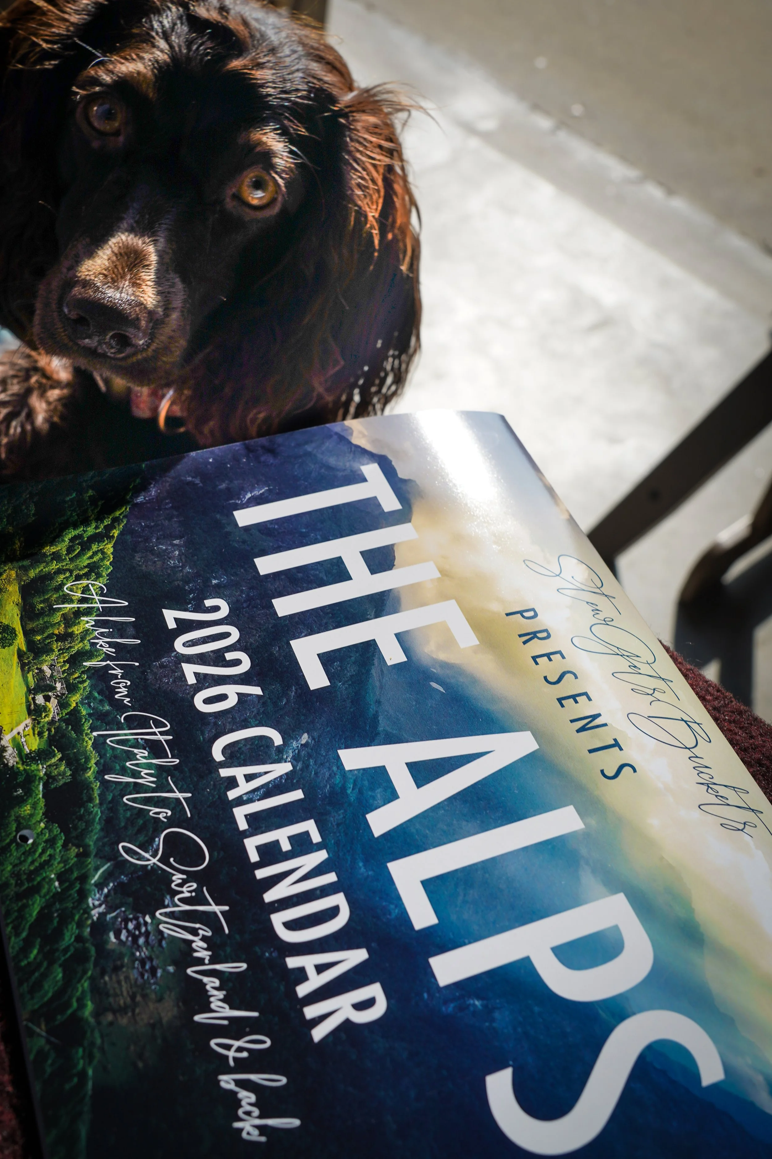
Daisy-Doo with the work copy [52/75]
This is, once again, the proudest I’ve ever been of anything. The preparation, the process, the results. It’s a wholly rounded project. I made a short video for Instagram. I did all the graphic design seen in the ‘month’ photos above. Of course I took all the photos. I wrote this! And I hand-painted 75 copies. I am so damn proud, and I am so damn blessed to have the support and love that I do.
When you hang that calendar up, I’m with you, every single day. That means the world to me.
Thank you.
I hope you have the best year of your life. Here’s to 2026.
[UPDATE] 12/26/25 3PM EST - 54 copies have been sent out with 5 more pending. As soon as I start hearing back I will share some of the locations where they ended up across the country!
12/31/25 1:30 EST - 62 copies have either been sent out or landed. I’m getting tons of great feedback, as far as Colorado thus far. Thank you all so much. Instagram giveway today or tomorrow!
1/4/26 9:00 EST - 66 copies sent out, 5 pending. 4 copies remaining. Two large donations made via the giveaway (thanks Kyle and Kristen!)